Responsive Website Design
The philosophy: Building a single website that responds to the screen size of the device (phone, tablet, desktop) instead of building multiple sites for each of these devices.
Below is an example of how the popular tech website Mashable.com utilizes responsive design.
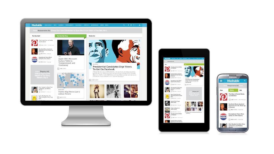
Credit: Mashable.com
The advantages: There is no need to create a special mobile site – responsive design gives you one site to develop and optimize for search.
Responsive design allows us to prioritize which information your users see first on smaller devices instead of forcing them to zoom in. Having to zoom in wastes their time and doesn’t get them the information they need when they’re on the go.
Maybe you’re proud of your website’s colorful homepage with lots of information, options, and images – that’s good! But a mobile user doesn’t necessarily care about seeing all of those nice things. A mobile user likely doesn’t want to see all of those nice things packed into their limited screen space. A mobile user who is looking up your business wants to see the most pertinent information first – and they want to be able to use it on their phone. They want to see your menu, your latest sale, your business ranking, your hours, your location. They don’t want to have to zoom in to a tiny-looking page or be bombarded with your spinning photo gallery that doesn’t even work on their phone.
“But I need cool things like spinning photo galleries on my site!”, you might say. Well, if your website is responsive, you can have all the fancy doohickies you want – mobile users just won’t necessarily be forced to see them. Truly responsive websites use something called “media queries” to determine who is looking at your site on their phone and who is looking at it on their home computer. A “media query” may sound like scary tech jargon, but the concept is really quite simple.
A media query is a piece of code in your website that can ask “What is the screen resolution of the device that’s looking at me right now?”, among other things. If the media query finds that the screen is of a certain size (say, the size of the average smartphone), your website will only serve up the most important information to what is most likely a mobile user. If it finds that the screen is really big (like someone sitting on their computer at home), then your website will serve up all your spinning photo galleries and other fancy-schmancy cool stuff!
Again, in short: Responsive design prioritizes which information different types of users see first (all from your one website), allowing for a pleasant and useful viewing experience – regardless of the device being used to view your site.